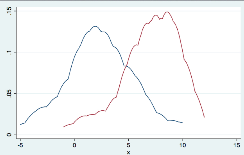
This is a simple chart plotting the distribution of Clinton& #39;s margin in the September national polls in 2016 (blue) and Biden& #39;s in 2020 (red). What should stand out here is a. Biden& #39;s lead is clearly bigger (7 vs. 2ish). b. But also those averages comes with a margin of error.
What I mean by that is when you see Biden up say 9 or up 5 in a national poll, those results are perfectly normal and perfectly in-line with the average given a margin of error. If we weren& #39;t seeing it, then I& #39;d be greatly worried.
Chances are the average is right... but sometimes, of course, it isn& #39;t... Which way might the error go? Who knows. But what we can clearly say is Biden heads into debate 1 in much better position than Clinton did.

 Read on Twitter


